
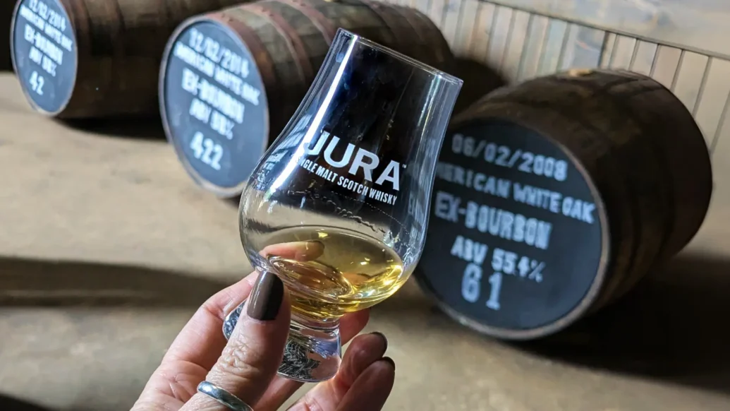
In a rare move for a Scotch whisky brand, Jura is retiring its 10 Year Old expression, ageing up its entry point to the brand’s 12 Year Old. The Whyte & Mackay-owned brand also unveiled its new line of packaging that has been thoughtfully designed to make it more accessible to those who aren’t seasoned whisky drinkers.
The unconventional decision is the result of consumer taste testing that revealed drinkers preferred the additional depth and flavour of 12 Year Old dram to its younger counterpart. “We’re doing this because consumers have told us they prefer Jura 12 better than Jura 10, and we listened,” said Claire Blackadder, Head of Brand for Jura.
“We’re putting a spotlight on Jura 12 and making it our hero product, and the entry-level to our aged whiskies,” continued Blackadder. The change to the product line-up shows that Jura is content to forge its own path in the industry and express the brand’s individuality. “It has given us an opportunity to pause and reflect on what makes Jura so special,” said International Malts Specialist, Andy Lennie.

That reflective pause allowed the whisky makers to address other questions, too. One such question was, when discussing the house style, “How can we communicate that flavour in the most understandable way?” continued Lennie.
With two-thirds of shoppers who go out looking to buy whisky coming away empty-handed, Jura decided something needed to change. So, the team simplified the tasting notes to just three words to describe the main flavour profile, removing unnecessary and confusing language and descriptions.
Alongside the pared-back descriptions, consumers can find a taste scale — an industry first, according to Jura — rating from zero to six, which shows the strength of the headline flavours in the blend. For example, Jura 12 Year Old scores four out of six for peach, and both walnut and citrus score three, making peach the most prominent of the flavours.


For those looking for a more in-depth description or additional details about each blend, every pack has a scannable QR code, taking them to a page filled with technical information.
The new-look packaging, created in partnership with design agency Stranger & Stranger, took inspiration from the home of the brand, the island of Jura. The concept, known as the ‘fabric of the island’, incorporates expressive textures that depict the island’s topography, as well as the coastal sea spray.
The design strips away jargon, spotlighting what matters: origin, age, and core flavour profile. These things combined, Jura believes, will make whisky a more relatable tipple for younger drinkers and those who have long avoided it through a lack of understanding of the spirit. “It’s always about approachability and enjoyable whiskies,” said Lennie. Whether you drink it neat, in a cocktail or over dinner with friends, accessibility is the key. “For us,” concluded Lennie, “that really is the spirit of Jura.”
With this bold repositioning, Jura aims to bridge the gap between tradition and modernity — offering clarity without compromise. Whether purists approve or not, the island distillery is charting a confident new course and embracing change in a tradition-led industry.

- Canal Toys Mini Speaker: Tiny triumph or massive miss? - 23 July 2026
- Blue Turaco coffee: A morning cuppa with a conscience - 17 July 2026
-
 P&O Cruises Keel & Cow menu gets a makeover - 16 July 2026